Hello.
My last newsletter was over a month ago and oh boy, where has the time gone? And where have I been!?
Honestly, I just haven’t had much to say for the last month so I took a little bit of time off writing and I really haven’t been up to much! It’s been nice.
If you looked in the Drafts folder of North of Somewhere, you’d see a couple half written, poorly formed thoughts on the AirBNB situation, The Citizen sale, and a couple other bits and bobs but rather than publish them, I kind of just said, “meh” and that felt like the right thing to do.
To summarize those feelings:
I’m a fan of anything that allows more people to buy homes that they will live in and anything that helps the affordability of housing. My ideal world is one where real estate is not seen primarily as an investment that will 2x every decade and be the backbone of generational wealth and/or an entire family retirement plan.
It has NEVER been a better time to try to hide mistakes or be corrupt in PG (I'm not saying those things ARE happening, but with the number of local PG journalists approaching 0, the tools for accountability get weaker and weaker and that makes me just a little terrified).
Anyways, no more talk about these small unimportant things because we have a big topic to jump into.
WE’RE TALKIN’ ABOUT SIGNS THIS WEEK, BABY.
A new sign emerges.
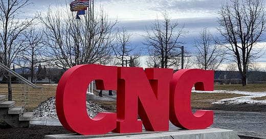
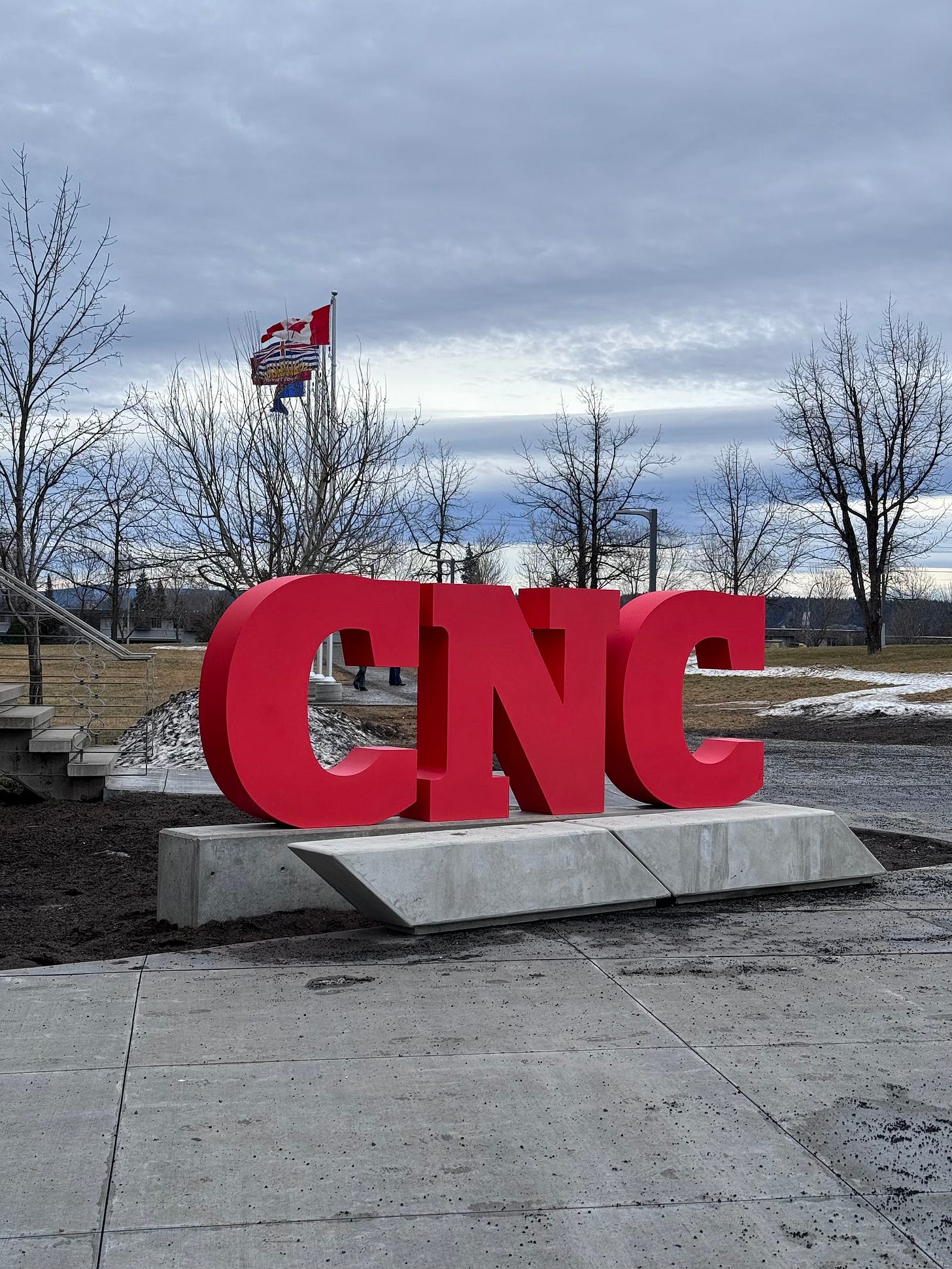
CNC unveiled their new sign a couple months ago and I gotta say, I love this sign.
In Roman Mars’ book “The 99% Invisible City”, he talks about how the built world (our streets, our buildings, our signs, etc) are their own language and we learn a lot about our cities from observing them.
One of the big things they communicate to us is WHO our spaces are for. In his examples, he often uses signs as one of the biggest indicators. Where are the signs placed? From which angles are they readable from? How big are they? What is around them?
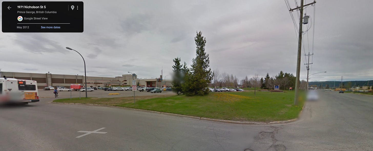
This new CNC sign COULD have been placed out on the curb of 22nd to invite cars in from the road:
But it isn’t and I love that it’s a sign meant for people, not cars. I see it as a small symbol but a rare one in this city.
Some thoughts on signs in PG.
The thing you start to notice in Prince George if you pay attention is almost all of our place-welcome or place-celebration signs are meant for car traffic. From our way finding signage, to our business facades, to our “WELCOME TO” signs - it all symbolizes a preference for car traffic, not pedestrian traffic. They are for cars to be welcomed, not pedestrians.
I’ll quickly say here - I’m not a crazy person - this makes sense in a lot of scenarios - the WELCOME TO signage for any municipality is both a logistical and symbolic welcome from the highway and those should be large enough to be visible from the road, and read from the speed of a highway vehicle.
But many municipalities (both large and small) have found ways to use signs to celebrate pedestrians.
I’ve been reading the book “Happy City” by Charles Montgomery (which I cannot recommend enough - it’s 10 years old but feels even more relevant now) where loosely lays out the subtle design decisions that make “social spaces” and “antisocial spaces” in our downtowns - these decisions have incredible impacts on people’s perception and people’s behaviour.
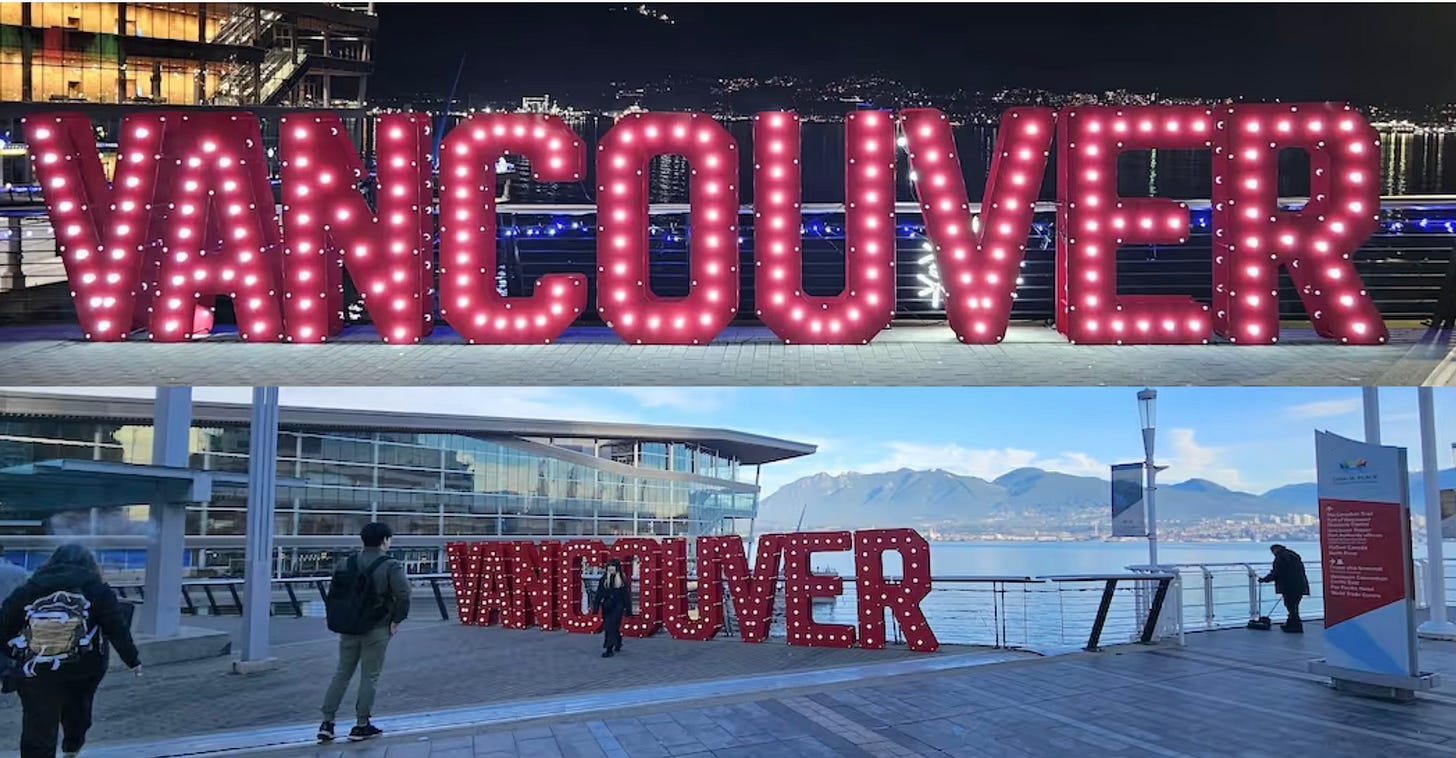
The (temporary) Vancouver sign above (or even thinking about less “sign” symbols but the Gastown Steam Clock) all create opportunities for citizens and tourists to gather and celebrate place. These little social nodes do a lot for our psychology of place - that little bit of buzz you notice as you walk (or drive) by, the photos you might scroll by on IG or Facebook of people smiling near that place - they amount to something significant.
Once upon a time, I think Mr. PG might have been that for Prince George (again, less of a sign and more of a beacon) and even though his size kind makes him a bit more complicated to place in a convenient pedestrian centre, I do think having a more modest size Mr. PG on the corner of 3rd and Dominion with a little plaza around him would make for an incredible celebration of place.
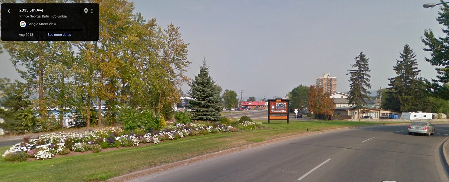
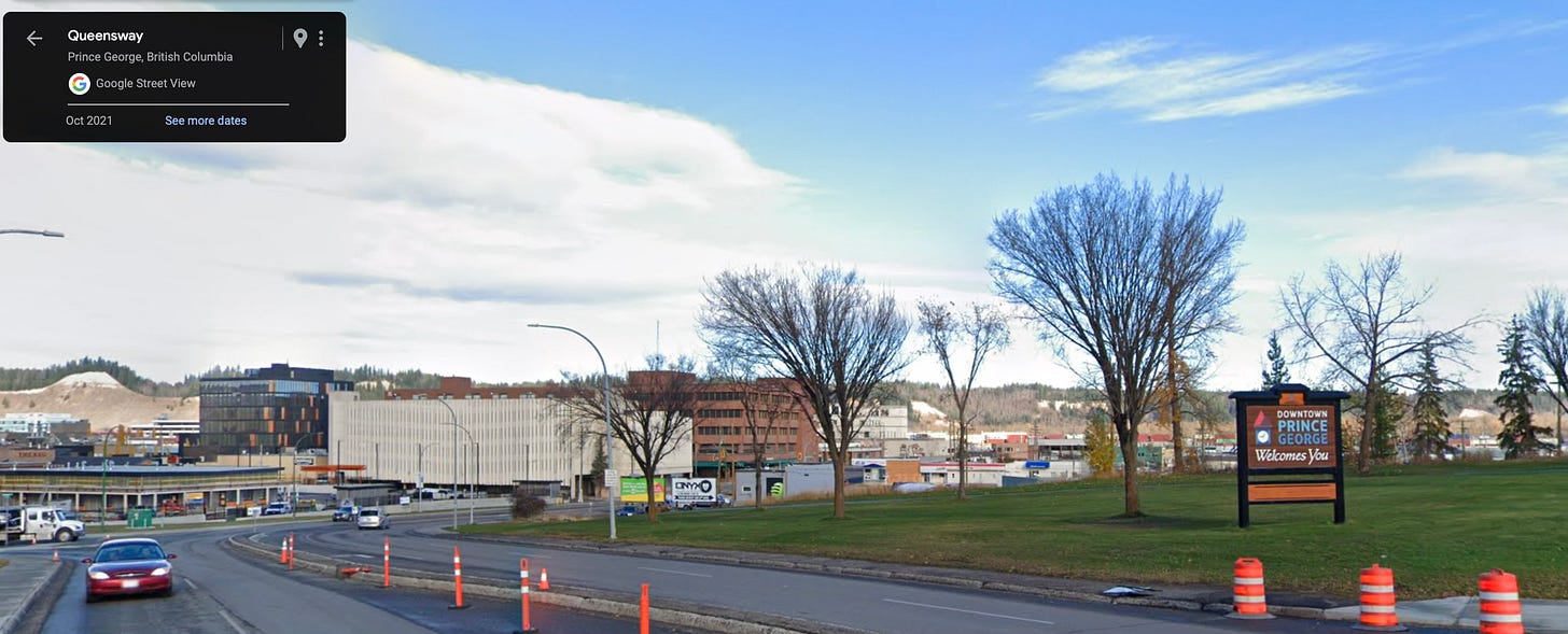
Instead, our only placemaking welcome signage for downtown are these two signs - and they’re nice signs, don’t get me wrong. I love the clocktower iconography, I’ve always been a fan of the pleasant Downtown Prince George blue colour palette.
But, as we’ve talked about, our built world sends us signals and these signs being the designated gateway welcomes tell us that our downtown is meant for cars. What would it symbolize if our welcome signs were at the bus stop on 15th near Staples and further down 4th near Books and Co and maybe, while we’re wishing, near all the hotels by the library. What if they both had benches and trees and walk-up paths and nice lighting?
Excerpt from “Happy City” by Charles Montgomery.
Again, I’m not a full-on WE MUST TEAR DOWN ALL CAR SIGNS guy. PG is a car city, and most people (even visitors) access our downtown via car traffic. We gotta play cards with the hand we’re dealt and right now, these signs serve our downtown well.
BUT it doesn’t mean we can’t include some of these thoughts in our capital P plans, in our discussions of way finding and welcome signs, and overall remember that every little design decision matters - so I hope you pay attention to the signs around you and if you see someone in the CNC Marketing department, you say “good job.”
That’s it for this week! This was a super long one so I’m going to do a super quick PG recommendation at the bottom here.
If you’re reading this, I’m going to assume you already love Ivy’s Kitchen as much as I do but as I was recovering from my wisdom teeth surgery last month, I think I ate the Beef Pho from there half a dozen times. It’s become my new “I will bring visitors here no matter what” restaurant in town and I think if you’ve been searching for an excuse to go (even if you’ve been recently) this newsletter is your ticket.
Alright. I’m back to some level of regular programming so talk to you all soon!





Having spent a good deal of last year making paintings about northern BC billboards and road signage, you KNOW I love this! New CNC sign is good design at work; these seemingly subtle choices should not be overlooked. And wow do I love the idea that an urban landscape is a “collection of memory and emotion-activating symbols” - sounds like I need to read this book 👀
Roman Mars my beloved! 99% Invisible was the podcast that got me into podcasts. I suggested his book to PGPL and they purchased it: https://catalogue.pgpl.ca/client/en_US/default/search/detailnonmodal/ent:$002f$002fSD_ILS$002f0$002fSD_ILS:384047/one This is also a plug for requesting that the library purchase things! I've made a few recommendations and I think all but one was added to the collection.
Thanks for these thoughts, and the book reccs. UNBC's signs are very clearly meant for car traffic - which also makes sense, as the campus itself is tucked off the main road and not really visible from University Way, and folks unfamiliar with PG often come to the uni to visit, present, or enrol. The David Douglas Botanical Garden on campus is exactly the opposite - the signage at and throughout the garden, combined with the paths, make it inviting to walk through, and I understand that their expansion will have a similar layout. Both of these places, and their signs, serve different purposes - but it's a great juxtaposition, and one I hadn't considered before.